
WHOT AFRICA have created the best and most fun digitised WHOT card game to be enjoyed anywhere and at any time the craving comes to connect with your childhood and relive all your fun moments, with certain twists.
The brief is to:
1. Review and evolve the user experience design of the app.
2. Increase user engagement on the app.
3. Improve navigation to help user complete tasks.

I followed the agile process above.
Starting with research and planning, then used the insights to design and create a prototype I could test by the end of the each week.

It's important to know how well the product is doing and areas that require more attention.
With this UX focused redesign, we expect these metrics to improve significantly.

I tested the current app by creating list of tasks . While carrying out these tasks, I was able to identify user pain points.
Another test was carried out with users to identifying their pain points and thoughts.


The findings from the UX audit were grouped into an affinity diagram. As shown on the right , I was able to pull out major pain points of users and Must Have features that are valuable to users.

A site map was created to organise the structure of the mobile app. With the site map I was able to ensure an easy navigation existed by establishing a hierarchy.

The journey for a new user starting from opening the app to playing a campaign mode game.

Different concepts were sketched out and presented to users and business stakeholders. Concept 3 was the most preferred layout because of its engaging look.


Mid-fidelity wireframes were created and connected as a prototype for testing. Users relayed their feedback and iterations were made and tested again


Lorem ipsum dolor sit amet, consectetur adipiscing elit. Suspendisse varius enim in eros elementum tristique. Duis cursus, mi quis viverra ornare, eros dolor interdum nulla, ut commodo diam libero vitae erat.
A vibrant purple and yellow colour palette was chosen to convey excitement and the colours were paired with high contrast colours to ensure high accessibility .

Montserrat was chosen to be used because of its bold and modern look. It is paired with Open Sans, which is clean and easy to read.


The Whot Africa logo was cleaned up and made to have a slick modern look.
The created visual identity was applied to the final wireframes and tested with users. Afterwards it was successfully handed off to the developers.


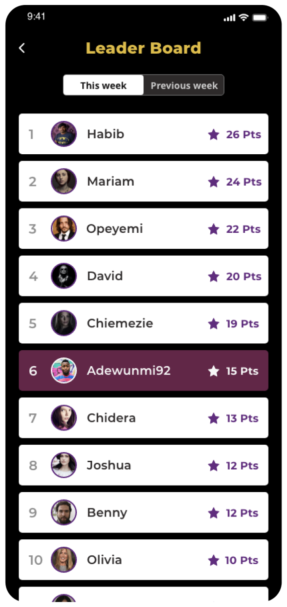


The created visual identity was applied to the final wireframes.


