
Most SMEs and even large companies have poor data records, particularly financial data. Why? Many don’t prioritise having an accountant. Other’s just don’t prioritise book keeping and see it as bureaucratic. To some it’s important but complex, so they start but don’t finish.
BluBox is a financial planning web based SAAS tool that helps businesses record and generate simple financial reports and access corporate financial services. Blubox doesn’t necessarily replace accountants, but rather serves as a useful product for the client’s accountant, the business owner (if the business owner wants to manage the accounts themselves), and the external accountants.
I followed the agile process below. Starting with research and planning, then used the insights to design and create a wireframe prototype I could test by the end of each week.

It's important to know how well the product is doing and areas that require more attention.
These metrics will be tracked once the product is launched.

The research process started with a competitor analysis of the other platforms available to users.
Afterwards I conducted user interviews, talking with various SMEs to get insights on which platforms they use and how their experience has been.
A few SMEs were interviewed and the quotes on the side were statements that stood out. The interviews provided valuable insights on their experience with other platforms. I was able to pull out some of their painpoints and learn about features that were important to them.

Based on the research and interviews conducted, two personas were identified which represent BluBox's target audience. The personas were used as guide throughout the design process.

The findings from the research phase were grouped into an affinity diagram. As shown on the right , I was able to pull out major pain points of users and Must Have features that are valuable to users.

A site map was created to organise the structure of the web app. With the site map I was able to ensure an easy navigation existed by establishing a hierarchy.

With the first draft of wireframes created, I conducted usability tests with users with in target audience. Feedback gotten from the tests were put into consideration during the design iterations.


Lorem ipsum dolor sit amet, consectetur adipiscing elit. Suspendisse varius enim in eros elementum tristique. Duis cursus, mi quis viverra ornare, eros dolor interdum nulla, ut commodo diam libero vitae erat.
A vibrant blue colour palette was chosen to convey professionalism and friendliness.
Secondary colours were added to be used for success and error states.

Nunito was chosen to be used because of its clean and modern look. It also has a full set of weights which is very valuable and its rounded character design compliments the brand's identity.


Lorem ipsum dolor sit amet, consectetur adipiscing elit. Suspendisse varius enim in eros elementum tristique. Duis cursus, mi quis viverra ornare, eros dolor interdum nulla, ut commodo diam libero vitae erat.

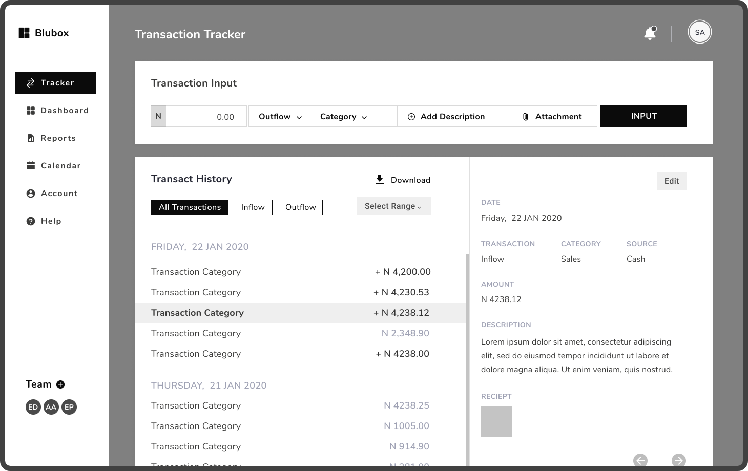
The created visual identity was applied to the final wireframes.


