Cocorose London was founded in 2007 by Janet Leo and invented her foldable footwear concept. Cocorose was conceived through her personal need and inspiration; a vision to improve and make easier the hectic lives of metropolitan women through portable fashion considerately designed for today’s modern world.
Review and evolve the brand identity and tone of voice within UI and user experience design.
Finding the products easily with an intuitive user experience combined with great customer service.
Make it easy for a busy, 21st century, multi-tasking lifestyle for women to buy shoes — flat sneakers shoes and foldable ballerinas. Getting their shoes quickly, no need to go to a store
I look lead in the Wireframe designs, conducting usability testing and rapidly creating prototypes of the designs. while actively involved in all other processes championed by my team mates.

The research process started with a competitor analysis of the other platforms available to users.
Afterwards I conducted user interviews, talking with various SMEs to get insights on which platforms they use and how their experience has been.
We interviewed a few Cocorose London customers and the quotes above were statements that stood out. The interviews also provided valuable insights where a major challenge was that the users were not able to locate the online support feature and the pre-order button. Hence, users had to email the company directly to ask questions and to pre-order shoes.

We started by distributing a survey to the target audience — Women from their late 20s to early 40s. Our analysis was focused on their online shopping patterns, what attracts to online shops and what makes them drop off.


We grouped all of our learnings into an affinity diagram. As shown above , we were able to pull out major pain points of users and Must Have features that are valuable to users.

Based on the research, three personas were identified which represent our target audience. Rosemary Ainsley became the key persona.

We mapped some of the pain points of the current website. The old sitemap communicates just how confusing and complex navigation was.
The New Site map shows the re-categorisation of the products and the simplifying of the navigation

When the user lands on the home page of Cocorose London’s website , this user flow above would be the path she follows from the home page to complete a purchase on a pair of shoes.

We mapped the process in which the personas would get engaged with the Cocorose Website, make a purchase on it and becoming returning customers.

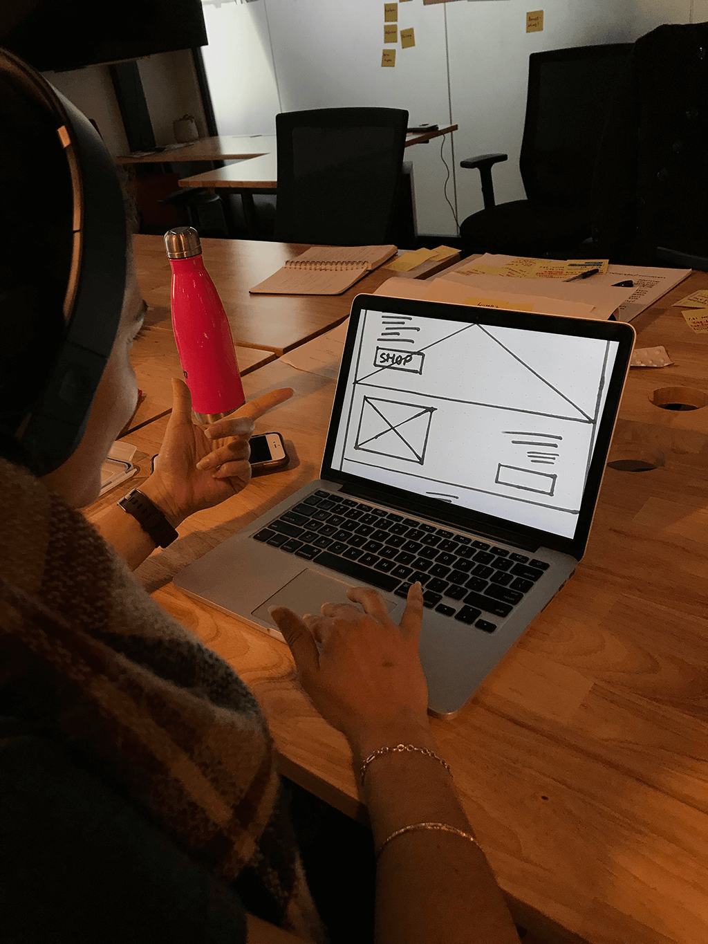
I started by designing paper sketches, made a prototype for testing before moving on to the mid-fidelity designs.
After the first version the the mid-fidelity wireframes, we performed usability tested on them and then adjusted them as mid-fidelity designs v2 before handing off to the UI team.

(1) The Red flow shows the home page design was retained from the paper sketch to the Mid-Fidelity Wireframe_v1.
(2) The Blue flow shows the shopping categorisation moved down in the Mid-fidelity wireframe_V2 and value propositions and brand story were introduced. After the testing again, it was moved up to right after the Brand’s story.
(3) The Gold flow shows the Testimonials moved up to after the Brand’s Story in Mid-Fidelity Wireframe_v1 and then moved to the bottom before the footer in Mid-fidelity wireframe_V2.
(4) The Teal flow shows the Value Propositions moved down to after the Personal Stylist Intro slide in Mid-Fidelity Wireframe_v2.

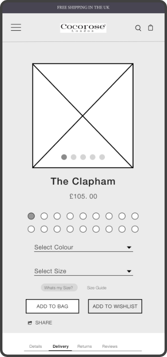
(1) The Gold flow shows the Heart Icon from the Paper Sketch was changed to ADD TO WISHLIST button in Mid-fidelity wireframe_V1.
(2) The Blue flow shows the extra products photos moved to the left side of the page in Mid-fidelity wireframe_V1 to create a cleaner interface.
(3) The Red flow shows the Navigation breadcrumbs in Mid-fidelity wireframe_V1 moved from the centre of the page to the left edge in Mid-fidelity wireframe_V2. which is a better position for users to locate it .
(4) The Orange flow shows the introduction the stars and reviews next to the product name. Which is vital information for the users.
(5) The Purple flows shows the addition of a colour selection drop down to ease the user’s search for colours. i.e If the user knows the name of a specific colour they want.
(6) The Teal flow shows the share icon was moved to the centre of the product image, where it can be easily located.

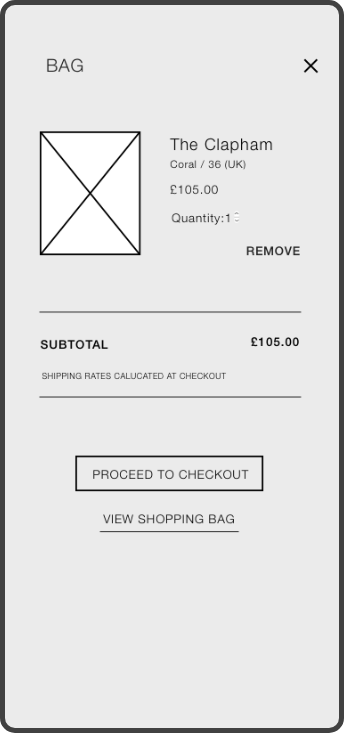
(1) The Gold flow shows the design of the Check Out Page from paper sketch to the Mid-fidelity wireframe.
(2)(3)(4) The Blue, red and Purple flows show the breaking of the Mid-fidelity wireframe to individual’s pages because users found the first appearance overwhelming with too much content


Lorem ipsum dolor sit amet, consectetur adipiscing elit. Suspendisse varius enim in eros elementum tristique. Duis cursus, mi quis viverra ornare, eros dolor interdum nulla, ut commodo diam libero vitae erat.
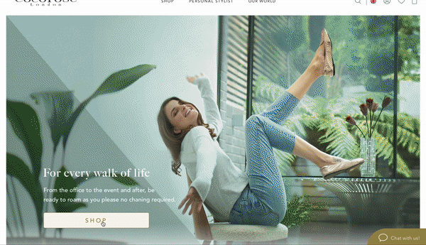
This art direction gives an Empowering, Happy and Excited Vibe.Which is perfect for evoking the “Feeling like a Million Dollars” emotions the client wants her users to feel.

The colour palette above was chosen to represent Value, Luxury, Happiness, Reliability and Sophistication